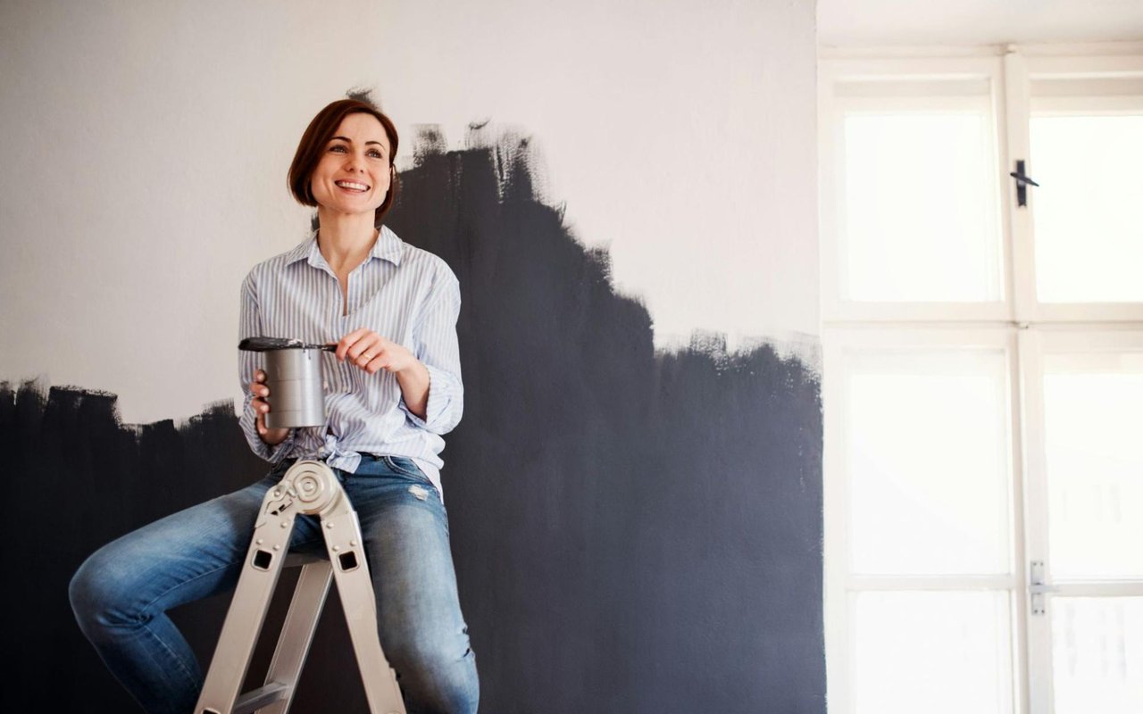
Choosing the right paint color in a luxury home is about far more than just aesthetics. It’s a reflection of personal style, a complement to architectural detail, and a way to influence mood and atmosphere.
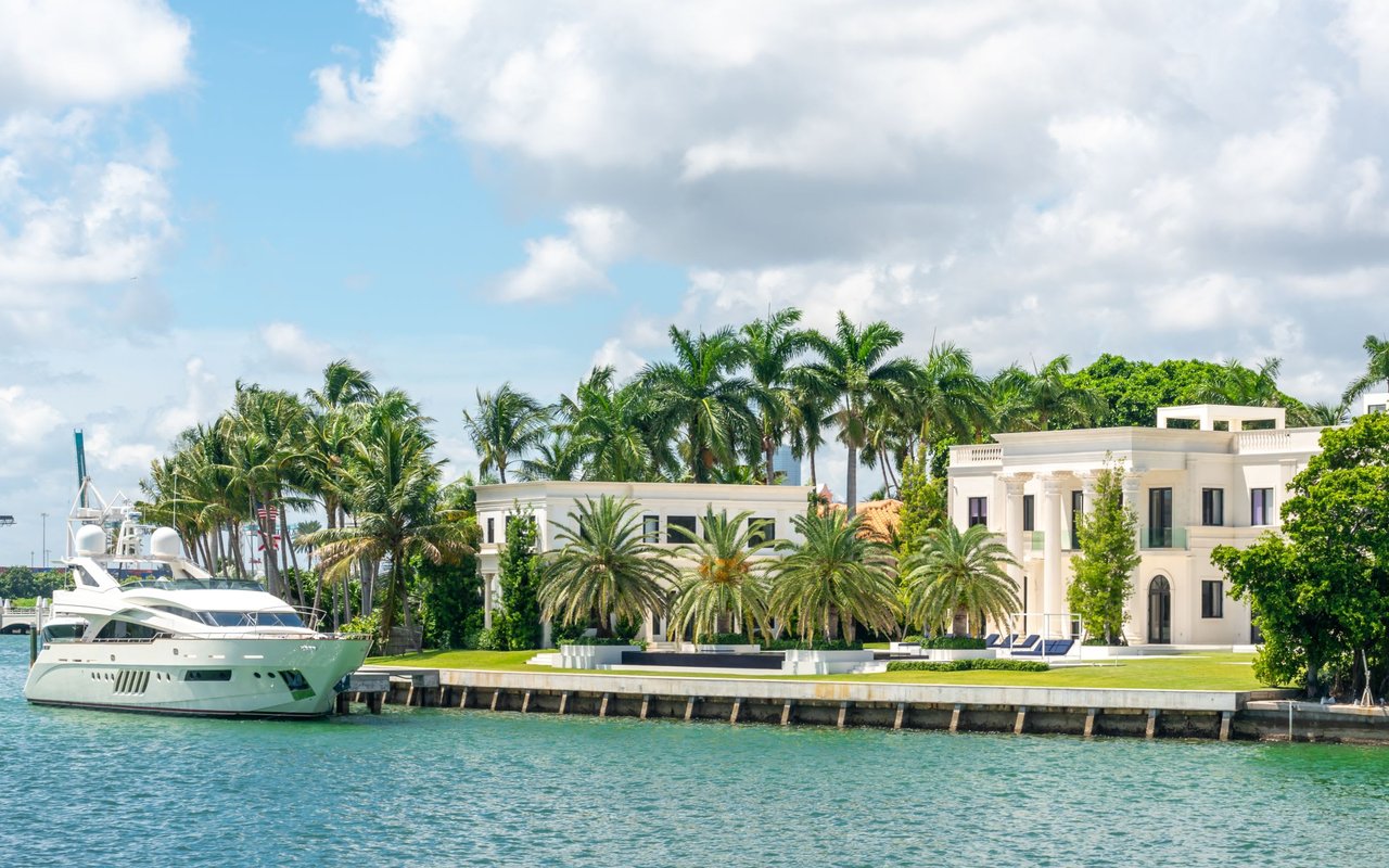
For high-end properties in Naples, Florida—whether it's a primary residence or a second home used for winter escapes—color selection carries added weight. Each tone contributes to a sense of harmony and sophistication, especially in interiors designed to impress.
If you're preparing to design, refresh, or stage a luxury property, this guide will walk you through the science and strategy behind using color to define every space.
Why Color Psychology Matters in Luxury Design
In luxury homes, colors aren't just decorative. They're psychological tools that shape how each room is experienced. Soft blues may promote calm, while deep charcoal can add a sense of grounded elegance. Every hue sends a message.
Color psychology becomes even more important in Naples’ luxury real estate market, where homes are often second properties or vacation retreats. For those homes, the right palette sets the tone for relaxation, indulgence, and escape from daily routine.
Before choosing any paint, it’s essential to identify the emotional intent behind each room.
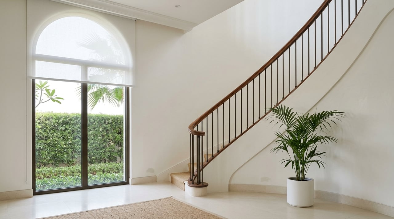
Living Areas: Set a Sophisticated Foundation
In open-concept great rooms and formal living areas, color should enhance natural light while grounding the space with elegance.
Neutral palettes are popular in Naples luxury properties because they create a timeless canvas for art, textiles, and natural textures like stone or rattan. Soft grey, pale sand, and warm white are commonly used to give these areas a coastal, upscale tone without leaning overly casual.
Want to incorporate more depth? Moody tones like slate, stormy blue, or olive can bring refinement to accent walls or architectural elements like coffered ceilings.
Layering colors by using different finishes—like matte on walls and satin on trim—adds dimension without changing the palette.
Kitchens: Crisp, Clean, and Luxurious
In luxury kitchens, color should communicate both cleanliness and culinary inspiration. White continues to dominate high-end kitchen design, especially in Naples homes where marble countertops and bright cabinetry shine against soft backdrops.
However, adding contrast is key. Consider deep navy or charcoal for islands or butler’s pantries to give the room structure without sacrificing brightness.
Accent suggestions include:
- Pale celadon for a spa-like freshness
- Cream with gold undertones for a traditional, warm glow
- Cool dove gray paired with brushed metal finishes
In second homes where the kitchen may see less frequent use, homeowners often take bold color risks, choosing bolder backsplashes or jewel-toned cabinetry to distinguish the space.
Bedrooms: Create a Retreat
Bedrooms, especially in luxury or vacation homes, should be restful sanctuaries. Naples homeowners often want their sleeping quarters to feel like an escape, and paint color plays a large role in achieving that atmosphere.
The best bedroom palettes use soft, cool tones like powder blue, lavender-gray, or sage green. These hues promote relaxation and pair beautifully with textured linens and wood accents. For a more romantic or opulent look, consider deeper shades like aubergine or a muted emerald.
Don’t forget ceiling paint: using a soft version of the wall color or a very pale gray can create a cocooning effect without enclosing the room.
Bathrooms: Spa-Like or Striking?
Luxury bathrooms in Naples properties often mimic the look and feel of high-end spas. Here, color should support the feeling of freshness and clarity.
White and cream are standards, but pale greens, seafoam, or warm gray can add a soothing touch. In contrast, powder rooms are ideal for dramatic statements. These smaller spaces handle deep colors well, making them perfect for black, navy, or even rich wine tones.
Dining Rooms and Home Offices: Bold, Elegant, and Defined
Formal dining spaces benefit from rich, deeper hues that foster conversation and sophistication. Navy, deep taupe, and terracotta tones elevate traditional dining rooms, particularly when paired with upscale lighting and polished wood furniture.
Home offices require balance. Colors should encourage focus without feeling cold. Soft green-grays and muted blues work well here, as they enhance concentration without distraction.
To strike the right mood in either room:
- Avoid overly saturated brights
- Choose matte or velvet finishes for added luxury
- Use trim and molding colors to frame and elevate wall tones
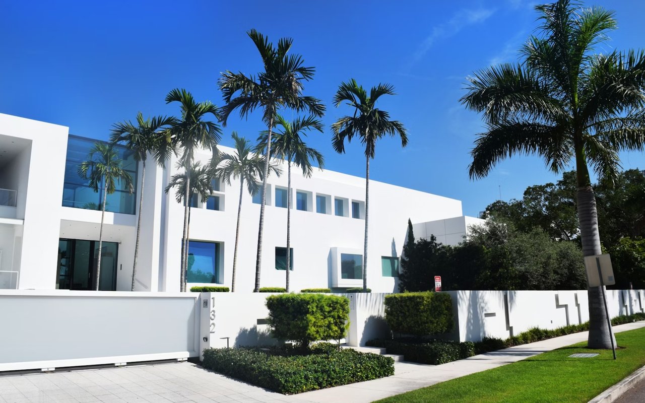
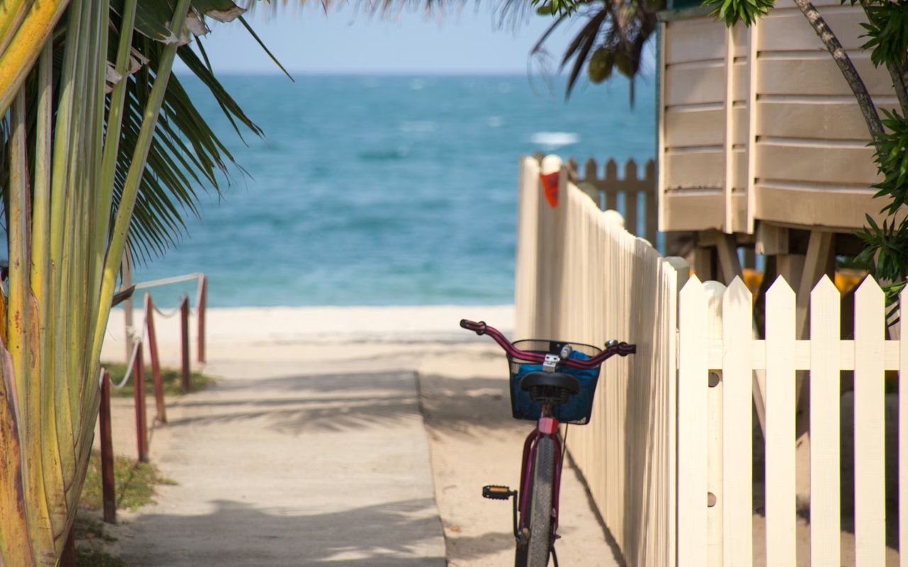
Secondary and Vacation Homes: Personalized Yet Polished
Second homes offer more flexibility in color choice. Owners often want these spaces to feel distinct from their primary residence—more playful, more relaxed, or more indulgent.
In Naples vacation properties, coastal palettes dominate: think soft turquoise, weathered gray, or sand-inspired beige. But there’s room to push boundaries. Coral-toned dining rooms, sun-washed yellow kitchens, or emerald green lounges all reflect a desire to “get away” without leaving luxury behind.
Make sure color flows from one room to the next. Use a unifying base tone—like a crisp white trim or ceiling color—to tie bolder hues together.
In a high-end vacation home, over-customization can limit resale appeal. Select bold accents strategically, and keep foundational tones neutral for market flexibility.
Lighting and Architecture Influence Perception
Paint doesn’t live in a vacuum. The natural light of a Naples luxury home—whether it floods through oversized sliders or bounces off coffered ceilings—can dramatically alter how a color reads.
North-facing rooms often benefit from warmer tones, while south-facing spaces can handle cooler palettes. Similarly, large-format tile floors, stone fireplaces, and glossy finishes will reflect and refract color differently.
Work with a color consultant if needed. Sampling multiple swatches under real lighting conditions is the smartest way to make sure your choice aligns with your vision.
Reach Out to The Taranto Team
Choosing paint colors for a luxury property isn’t just about personal preference—it’s about shaping the experience of the home, highlighting its best features, and maintaining the value of your investment. Whether you’re painting a newly built estate or refreshing a beloved vacation home, The Taranto Team is your trusted partner for curated, informed color strategies.
Their deep local knowledge of Naples luxury properties gives them an edge when it comes to recommending tones that match lifestyle, climate, and resale goals. The Taranto Team helps buyers and sellers alike navigate the details that turn a property into a sanctuary, and paint is one of the most powerful tools in that transformation.
Reach out to The Taranto Team today and take the first step toward bringing every room in your luxury home to life.